Introduction
In the recent Covid-19 pandemic, the UK government urgently required scientific information to inform policy. Scientific advice in the UK is received via the Chief Scientific Advisers and the Scientific Advisory Group for Emergencies (SAGE), which is convened to support the government in emergencies. The Scientific Pandemic Influenza Group on Modelling Operational sub-group (SPI-M-O) is responsible for providing epidemiological modelling advice to SAGE [1].
During the pandemic, epidemiological modelling terms, such as the reproduction number  , became common parlance and forecasts of daily incidence, deaths and hospitalisations were everywhere. Estimates for these quantities were provided by a large number of academic groups to SPI-M-O every week. However, multiple estimates are difficult to interpret and act upon, so how do you turn a set of predictions into advice that is unbiased, open, transparent and rigorous?
This article describes how a dedicated team of scientists at the Defence Science and Technology Laboratory, who specialise in uncertainty quantification, combined the outputs of between three and 15 world-class models into a single, robust estimate that could inform decisions within hours. To do this, they pioneered a methodology that is now accepted as best practice. The article goes on to explain why model combination is so important and how the mathematics community can use this as a starting point to improve future advice. It will also describe how statistics can be visualised to make them easier to understand, and it will look at why uncertainty quantification is currently one of the most important open problems in statistics research.
Accuracy and uncertainty
As a mathematician, I have always loved mathematics, the step-by-step logic and that there is a right answer. There is no debate or argument about a proof after it has been accepted and verified. However, as soon as we move away from the abstract and start to use mathematics to model the real world, randomness gets in the way and we end up with uncertainty. The wonderful, beautiful complexity of our world and the actions of the people in it refuse to submit to something as constraining as a mathematical model. So, how do we as mathematicians account for reality?
It seems to me that there are three possible approaches:
- We can create more and more complex models at higher and higher fidelities, trying to recreate the complexity we see all around us.
- We can accept that we will never be able to model reality accurately but instead try to create a simple model with an accurate estimate of our uncertainty.
- We can look at all of the currently available models and combine them into a single, uncertain estimate that we might hope encompasses that wonderful complexity of data and the many levels of fidelity.
There are benefits in all three approaches; however, I think that by combining the best that there is, we can always gain a better understanding.
Model combination for Covid-19
Model combination as an approach is not new. It has been discussed in the meteorological literature for years [2]. However, in other communities, it is still in its infancy, and there were only a few people working on model combination for epidemiology when Covid-19 hit in 2020. My team and I were some of those people, and the tool we developed, CrystalCast [3], was probably at the highest technology readiness level of all of them. CrystalCast can combine predictions from many different models and is used to understand and synthesise the various modelling outputs available in the UK [4]. However, getting the model outputs into the system and finding a way to combine single-number estimates, such as the  value, was something we had to develop as we went along, and we had to do it while maintaining a defensible technology readiness level.
Again, these problems are not new. Implementing a method that allowed UK epidemiological modellers to submit their model output as a file was a matter of defining a template and setting up a server. The innovation came from a conscientious team who felt that the modellers ought to be able to see what they had submitted as estimates of the course of the epidemic plotted against past data. This allowed tired modellers to instantly check that the data they were uploading were as intended, and it mitigated data and transcription issues. This visualisation also served as the basis for the later combined visualisations, which helped decision makers to understand what were, in fact, quite complex outputs, but more of that later.
Finding a method of combining point estimates was different. There were many possible mathematical constructs that could have been used. To some extent, it was a case of picking what worked; however, what we chose was pretty constrained. It needed to be a method that was well researched and recognised, as there was no time to peer review something new. It also needed to be something that could be understood and was simple to implement. It had to learn from the multiple estimates without making too many assumptions. The method that seemed to fit these criteria best was meta-analysis [5]. This article explores why it is an obvious choice, but also why it is nowhere near the end of the story.
What is the R number anyway?
During the pandemic, the number was often bandied around, but underneath a seemingly simple concept are a number of key assumptions. A really good discussion can be found in a paper by many of the contributors to SPI-M [4], but I will do my best to summarise.
is the effective reproduction number. It is defined for a specific time point, so it is more formally written as  . It is the infectious potential of a disease at time
  and is defined as the average number of secondary cases per primary case at a specific time. It is different from the basic reproduction number
  , which is the number of secondary cases per primary case at the beginning of an epidemic in an entirely susceptible population. This is because, during the course of an epidemic, the number of susceptible people drops and therefore, so does . Now, the reason that became so important is that it is a way to track the future of an epidemic; if
  , the number of infected people will remain constant. If
  , then the number of infections will grow exponentially. To bring an epidemic under control, you need to be below
  .
.
So, why is the value problematic then? The issue here is not the simplicity of the value but the difficulty in trying to estimate what the value is. If we could go out and find every infected individual in the population we are interested in and then monitor who they infect, we would know . The problem is that we can’t do that. The population is huge, and many of the infections are from asymptomatic, unobserved transmission, so we have to estimate . Now, there are several ways to do this, for example from the number of cases or deaths, or from survey data or models of the status of the epidemic or a combination of all of these. Unfortunately, all of these methods need data, which is inherently very uncertain and often biased. However, we have lots of data streams and lots of world-class modellers who can all use their models to estimate . This is where our chosen combination method, meta-analysis, comes in [6].
Meta-analysis
A meta-analysis is the process of synthesising data from a series of separate scientific studies [7]. It is a well-known and established method, used ubiquitously in fields such as medicine, climate science, psychology and education. It is applied when there have been lots of different experiments, and we want to combine the results into something more powerful. It is a rapid and simple approach, and crucially, it allows for uncertainty in the input estimates and provides easy-to-interpret outputs.
However, it is not perfect. If all of the studies are biased, then it too will be biased. If all of the studies are linked, it will borrow power where there is none. Finally, if the estimated input uncertainties are unrealistically narrow, it may up-weight these estimates, unless you are careful in the type of meta-analysis you do.
A detailed analysis of all of the potential methods can be found in [6]; however, the best method turned out to be an equally weighted random effects model:
(1) 
where  is the true value (or effect size) of interest for prediction
  (for a set of
  predictions).
  is the estimated value of prediction ,
  is the average value across all predictions and
  are the within-prediction errors. is sampled from a distribution, typically assumed to be normal, of mean and variance
  , which is the heterogeneity variance parameter [8].
The combined estimate  , with associated variance
  , can be calculated as follows:
(2) 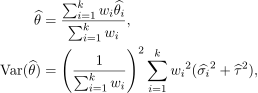
where  denotes the weighting applied to the prediction ,
  the estimated variance of the prediction and
  the estimated heterogeneity variance parameter, which is a measure of the heterogeneity (or variability) between estimates.
The standard weighting applied in a meta-analysis uses inverse variance, whereby  ; however, because in many of the models the uncertainty estimate is linked to the accuracy of the model (quite accurate), not the accuracy of the estimate (very dependent on data and assumptions, so not very accurate), this produces far too much certainty. Therefore, instead, we equally weight models so that
  . The corresponding combined estimate and associated variance from equation (2) become:
(3) 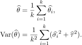
There are a number of parameters here that need to be estimated. This is a standard estimation task and we have a method for taking the best estimates of , which we get from all of our best epidemiologists, to produce one synthesised view.
The next sensible question is ‘How good is it?’ The benefit of this approach is that it is robust to the number of predictions we have. If we have only one prediction, that would be our combination. The performance of the combination is actually dependent on how good the individual predictions are. However, the benefit of the combination is that even if some of the individual estimates are biased or skewed, the combination is still fairly robust. The combination can tolerate up to a third of the input models being biased or skewed before it begins to get its estimates ‘wrong’ (Figure 1). Even then, as long as they are not all wrong in the same way, the estimate is still very good.
![Figure 1: A simulation study was undertaken where bias and skew were randomly added to real model predictions to assess robustness. Full details of the study can be found in [6].](https://ima.org.uk/wp/wp-content/uploads/2022/09/Figure-1-A-simulation-study-was-undertaken-where-bias-and.png)
It is also pleasingly robust to correlated input models, which is a concern, as there is no easy way to check how similar models from different academic groups using different data streams might be. So, while in any given week a single model may produce a ‘better’ estimate – in that it has less uncertainty and still contains the true but unknown value of – as we have no knowledge of which model that might be until afterwards, the combination is better overall.
An important question remains though. Is this the mathematically optimal combination method? The answer is that we do not know. It definitely works well, and it is very robust to many factors of concern [6], but assessing whether it is optimal requires a lot more research. It was definitely good enough and the best that we had at the time. It was better than individual estimates, and it is an accepted and validated method. But like anything in life, I think we can improve upon it given enough time and effort.
I, therefore, hope that in the months and years to come, others will take up the baton and develop new combination methods, identify when they work best and when they break down, and determine whether using some criteria to decide which models are combined would improve accuracy. This effort in parallel with ongoing work on how complex models should be and how uncertainty can be calculated will surely prepare us better for these kind of events in the future.
However, even while this work is continuing, there are other efforts that are also needed. For me, the real key is the research underway into presenting information to non-mathematicians because even as we are starting to realise the importance of uncertainty, it is becoming increasingly clear that how people understand it is not clear at all. There are currently huge efforts in this area, with the Winton Centre in Cambridge currently leading the way, but each circumstance is different and how we as mathematicians communicate is just as important as what we communicate.
Visualisation
Uncertainty and risk are generally poorly understood. There are many potential graphical representations, but do we really understand them? Take the standard interquartile range. For a point estimate, if we know whether we are talking about frequentist or Bayesian uncertainty (a tale for another article), we can be fairly sure we know what we mean. However, consider a function, such as the predicted number of hospitalisations through time. Figure 2 shows medians and interquartile ranges over time. However, the medians do not necessarily track the path of the actual numbers over time. So, is plotting these lines misleading?
![Figure 2: Median values (coloured lines) of hospitalisations and associated interquartile ranges (shaded) for various R numbers. Dots are data points. Following [6].](https://ima.org.uk/wp/wp-content/uploads/2022/09/Figure-2-Median-values-coloured-lines-of-hospitalisations-and.png)
Furthermore, if the numbers turn out to be lower, does that mean that in the next time period the upper values will still be equally likely? Clearly not. In fact the actual path of the data through the coloured area could do many things, but one thing that the numbers will not do is jump from the bottom to the top for instance. So, even in this relatively simple example, the interpretation is not obvious.
Communicating uncertainty, like combining models, is not something that can or should be rushed. Ideally, it needs to be thought about before we even start modelling, as what we present as our results and how we do so could and should guide our research from the outset. For the number, we came up with Figure 3.
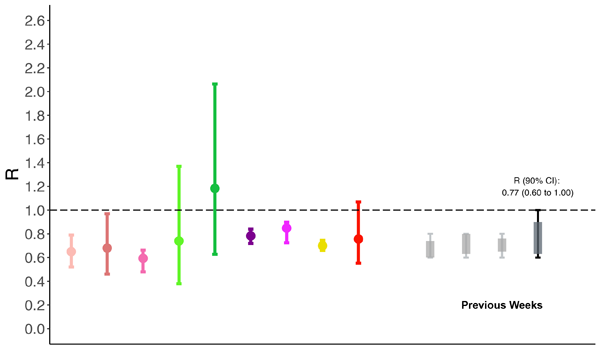
Now, this graphic took time to develop. It captures what has been happening so that we can track any changes in the range over time. It also shows the individual model estimates against the combination, so that you can see how the individual models vary too. The colours are assigned to individual epidemiological groups, so that if a group submits two estimates from different models, we can immediately see which ones those are. As a first step to accommodate colour blind readers, the palette also tries to distance red and green, but this is the first obvious limitation. The next is that the individual models and the combinations appear slightly differently. This is deliberate, as it helps to distinguish them, but research into whether this helps or causes confusion would have taken time that we did not have.
To be honest, I quite like it. The graph makes sense to me, but I have looked at this graph and thousands like it day after day for nearly two years. I can no longer look back on such graphs with fresh eyes, so I am definitely biased.
Moving forward
There is no doubt that Covid-19 hit each and every one of us to some extent. There is very little positive that can be taken from it, but there is some. Clearly, thousands of people went above and beyond to help, including huge numbers in the mathematics community. The models my team and I combined were generated by teams of world-class epidemiologists working round the clock under immense pressure. Without these efforts, we would quite literally have had nothing to combine. But even outside of this effort, there were many others working hard too. The Virtual Forum for Knowledge Exchange in Mathematical Sciences was started during the pandemic, for instance, and hopefully, the benefits of that will be felt for years to come.
For me though, the pandemic also helped to identify the areas of mathematics that I think are crucial areas of research going forward, namely uncertainty quantification and communication. First, what level of model fidelity should be used to model the real world. Is higher fidelity better, or is it just harder to parameterise and therefore, more uncertain? Does combining a set of model outputs always give a better picture of the real world? If so, what does the ‘best set’ of models look like and what is the best combination methodology? And, finally, how do we communicate the huge underlying complexities of these seemingly simple concepts so that everyone can understand them?
Veronica E. Bowman OBE CMath FIMA
Defence Science and Technology Laboratory
Acknowledgements
This work was conducted within a wider effort to improve the policy response to Covid-19. The author would particularly like to thank the SPI-M members and modelling groups and the SPI-M secretariat for their efforts and support, as well as staff at Public Health England without whom this work would not have been possible.
The views and opinions expressed herein are those of the author and do not necessarily reflect those of Dstl.
Crown Copyright ©2022 Dstl. This information is licensed under the Open Government Licence v3.
References
- Brooks-Pollock, E. et al. (2021) Modelling that shaped the early Covid-19 pandemic response in the UK, Phil. Trans. R. Soc. B, vol. 376, art. 20210001.
- Semenov, M.A. and Stratonovitch, P. (2010) Use of multi-model ensembles from global climate models for assessment of climate change impacts, Clim. Res., vol. 41, pp. 1–14.
- CrystalCast (2020) Advanced disease forecasting to predict outbreaks and anticipate population impact, Product sheet.
- Silk, D.S. et al. (2022) Uncertainty quantification for epidemiological forecasts of Covid-19 through combinations of model predictions, Stat. Methods Med. Res., art. 09622802221109523.
- Vegvari, C. et al. (2021) Commentary on the use of the reproduction number during the Covid-19 pandemic, Stat. Methods Med. Res., art. 09622802211037079.
- Maishman, T. et al. (2022) Statistical methods used to combine the effective reproduction number, , and other related measures of Covid-19 in the UK, Stat. Methods Med. Res., art. 09622802221109506.
- Borenstein, M. et al. (2009) Introduction to Meta-Analysis, Wiley Online Library, London.
- Langan, D. et al. (2019) A comparison of heterogeneity variance estimators in simulated random-effects meta-analyses, Res. Synth. Methods, vol. 10, no. 1, pp. 83–98.
Reproduced from Mathematics Today, October 2022
Download the article, The Good of the Many (pdf)